

I was bored yesterday, and too groggy to do anything more productive, so I made a bunch of pride flags to pass the time. I don’t believe it’s my place to bestow symbols on communities I have no claim to, so I’m only going to address those which apply to me personally. To start with, I’d like to place my cards on the table: I’ve had sort of a love/hate relationship with pride flags over the years.
As an amateur vexillologist, I have to say that many pride flags have objectively bad designs even though I fully support the spirit of acceptance they’re communicating. Part of me wonders if maybe the overall message of unity in our shared experience as gender and sexual minorities is being diluted by the balkanization of labels and subsequent fractioning of banners in recent years. To some degree, it’s a bit of a shame to see the ubiquitous, self-evidently diverse rainbow sort of overshadowed by visually bland flags with esoteric meanings which are not immediately clear to onlookers without a lot of additional explanation. For better or worse, I think it overwhelms and alienates people outside of the queer community.
But also…who really cares what I think, because pride isn’t just for me. Who am I to say that somebody shouldn’t fly a certain flag if it makes them happy? What gives me the right to demand acceptance for myself and my own labels while denying it to someone else? Nothing. At the same time, it’s genuinely fascinating as a lover of flags to see them evolve so consistently and often democratically in real time over the years. It’s bottom-up, “adoption by popular use” as opposed to top-down “a small committee voted so this is what you get” and that’s pretty cool. Even if I’m not a fan of many of the aesthetic choices which have caught on in this manner.
Also, I can only speak from my experience as both a bisexual and as a transwoman, but I’ve been made to feel unwelcome or less than by certain members of the gay and/or lesbian communities. Recently a local lesbians’ group decided to rebrand as cis only and us transwomen were told to take a hike. A few days ago a post on r/SapphoAndHerFriend, a subreddit which mocks instances of queer erasure in society, unironically engaged in trans-erasure. While the perpetrators were called out on it, they still garnered over a hundred upvotes in some cases, indicating a disheartening threshold of anti-trans sentiment even in what is supposed to be a queer space. I recently went to an LGBT+ oriented campsite and was often outright ignored whenever I tried to be platonicly friendly with the older gay guys there. With TERFs it feels like they’ve taken feminism into a deeply uncomfortably misandrist direction and are so bitter they extend that hostility to anyone who’s ever been perceived male. With some members of the gay male community, it’s like they love masculinity so much that they detest anything remotely feminine and see transwomen as the ultimate insult. (“You were a ‘man’ and you gave it away to be a yucky, inferior woman? Blasphemy!”) In what is supposed to be a community of love and acceptance, these factions have instead defined themselves by hate and intolerance. Unfortunately, it’s the rest of us who suffer for it.
So on that level, I understand why some people would not feel any connection at all with the traditional rainbow flag, older pride iconography and the people who tend to use them. I understand having a bad association with certain elements of the community and wanting visual indicators to represent the more inclusive subgroups within it as a result. I understand why, as the community grows and changes, new symbols are needed to express our developing sensibilities. I know if I see only a rainbow flag, without a bi or trans one in the same vicinity, that I should still expect to be told “bisexuals don’t exist, you just don’t want to admit you’re gay” or given weird looks and invasive remarks for existing as trans. It doesn’t happen every time, but it’s a frequent-enough occurrence for me to know that the rainbow alone doesn’t necessarily indicate a respectful place for the “Bs” and “Ts” in “LGBT.”
Now, I can already hear the skeptics moaning “so now we gotta fly every pride flag or be accused of bigotry because of your fee-fees?” but that’s not what I’m saying. I don’t think it makes someone bigoted or “wrong” if they don’t fly every flag or know all the newer lingo…I’m just saying for some people it helps us feel that we’re more likely to be accepted in a space which makes more of an effort to visually communicate inclusivity. Even ignoring all the newly added letters and banners for one second, LGBT still means at least 4 distinct subgroups with their own unique flags. To fly one without the others sometimes feels like deliberate exclusion, and in my lived experience, the crowds in such places sometimes reinforce that. Regardless of its meaning in 1978, the rainbow often signals “gay men acceptance only” in practice, despite those who still insist that other flags aren’t necessary because “the rainbow covers everyone.”
So with all that said, I understand why pride iconography has diversified in recent years. Things change over time, including flags. While some may not be particularly well-designed, an explicit indicator of support to your specific group is very affirming, especially considering the infighting within the overall queer umbrella. In the spirit of that change and diversity, here are some alternate pride flags made by me.
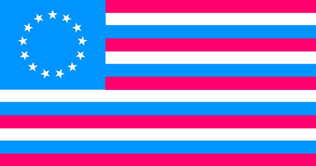
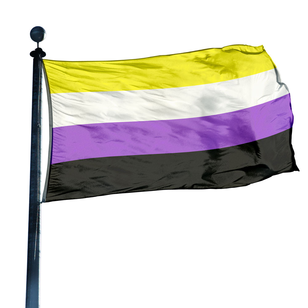
General Pride and/or Pansexual Flags
For those who don’t know, there’s sort of a bleedover between people who identify as pansexual and those who identify as bisexual. I usually go by the latter just because it’s a more well-known term and I think it has an objectively better flag. However, some assert that bisexual is trans and/or non-binary exclusionary, and others assert that it has a meaning which is different enough to warrant being a separate thing from bisexuality altogether. It really doesn’t matter, I just think its pride flag is ugly, arbitrarily designed and nearly everyone I’ve ever known in the bi/pan label have expressed similar feelings. So these are my alternatives.
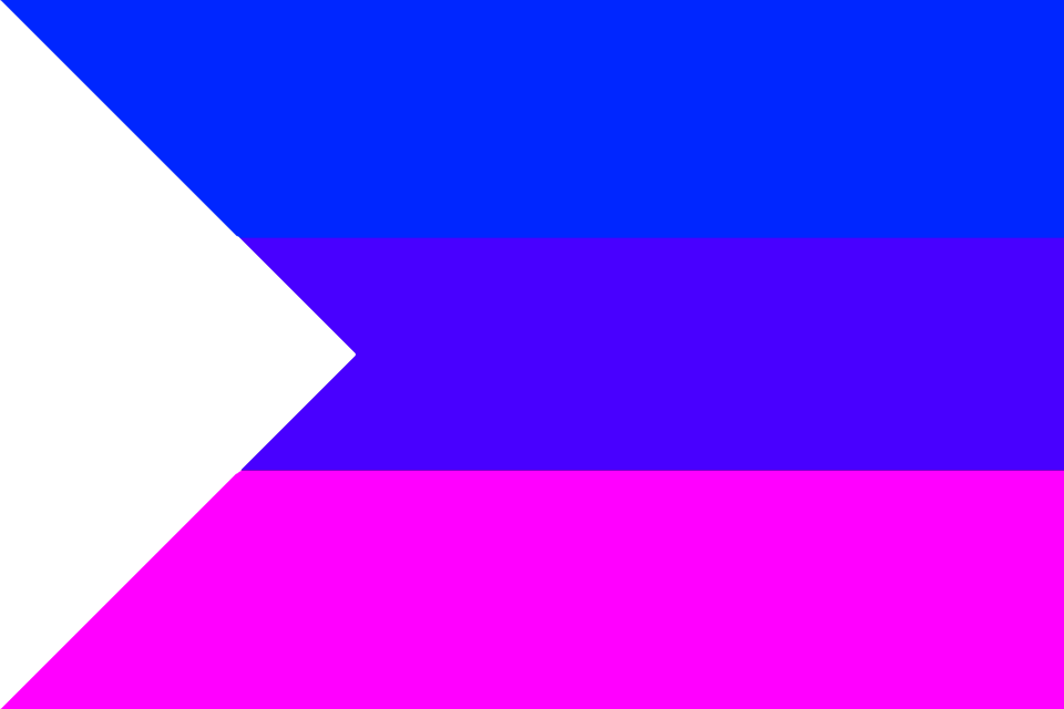
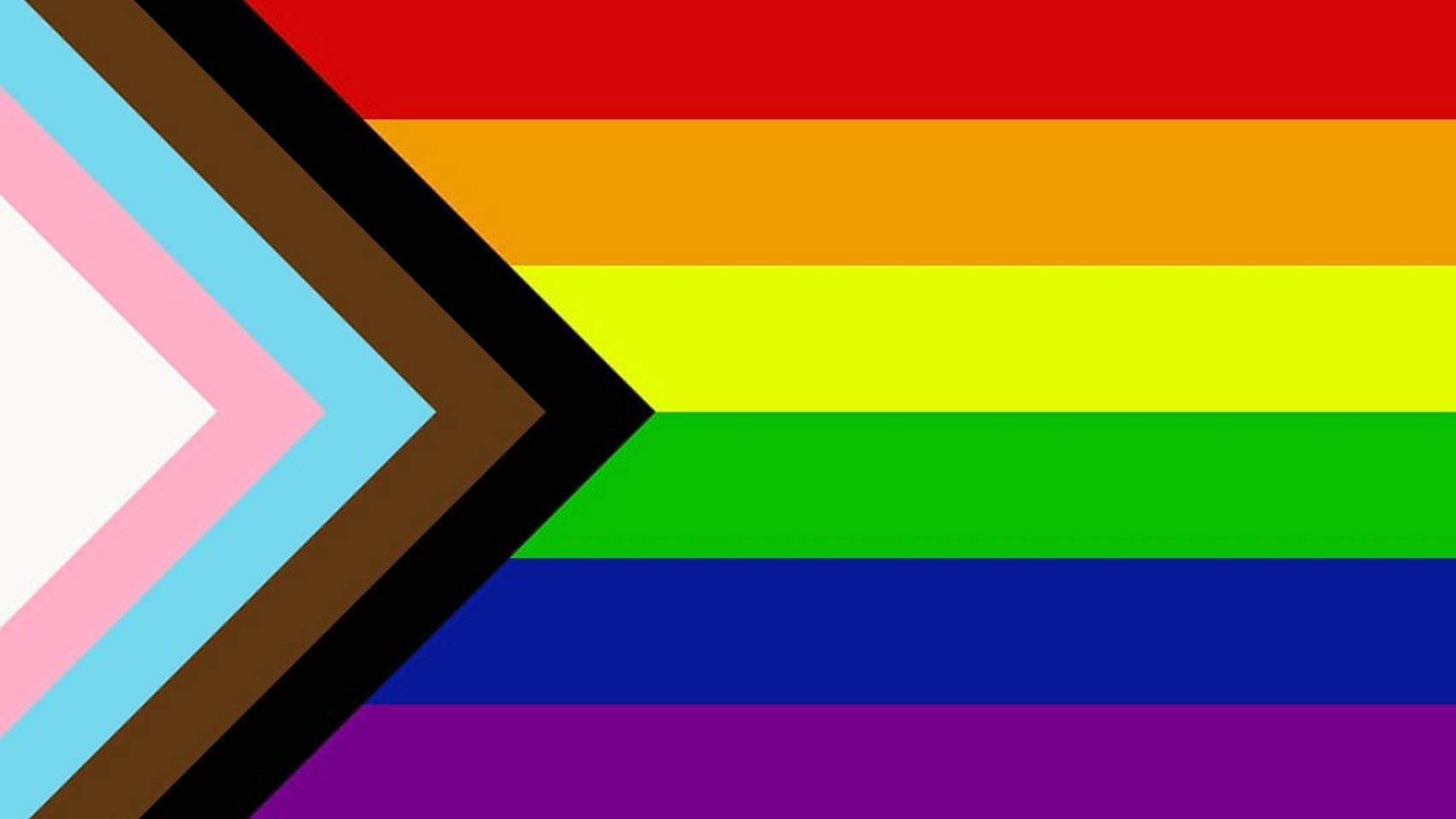
The one on the far right is admittedly a bit of an eyesore but it was my attempt to make a less “busy” Progress Pride Flag. (That’s a variation which has popped up in recent years and includes the trans and black pride chevron.) I removed the black and brown stripes, not because I don’t support racial equality (I hope that doesn’t need to be said) but because I think it’s a separate issue from the struggles of gender and sexual minorities. Anyone who thinks I’m wrong for doing so is welcome to borrow the design and add them back in if they so choose–in fact, I welcome it.
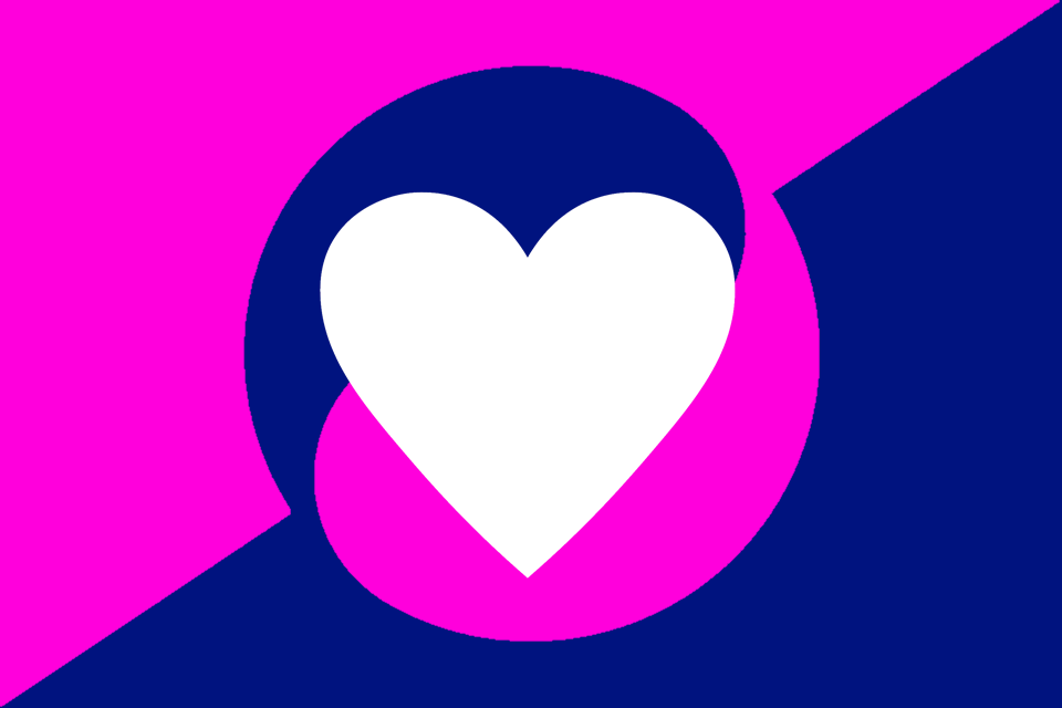
The middle one is my favorite pan design. It uses the color scheme of the visually superior bisexual flag but adds a modified transgender symbol to make it explicitly clear they’re included.
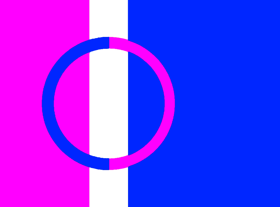
The one on the left is just me fooling around, trying to make a simple “all in one” rainbow flag that’s different from the original. The “X” with the alternate stripe pattern is meant to symbolize those whose perspective or lived reality of the community is different than the traditional.


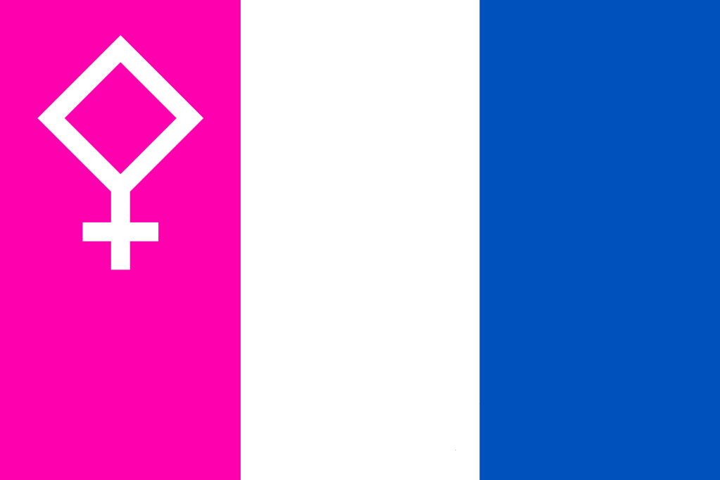
Bisexual Pride Flags
In my humble opinion, the Bisexual pride flag is the most beautiful, most eloquently designed and visually communicative pride flag of all time. It’s simple, the colors are gorgeous and anyone can instantly ascertain its meaning without any verbal explanation. This is not the case for most newer pride flags, which often strike me as arbitrary and visually bland in their aesthetic. (Nobody would know what the nonbinary or asexual flags are supposed to mean just by looking at them, for example, and I’ve never heard anyone refer to them as beautiful.) So, while you can’t improve upon perfection, I decided to play around with some alternate designs anyway just for fun.


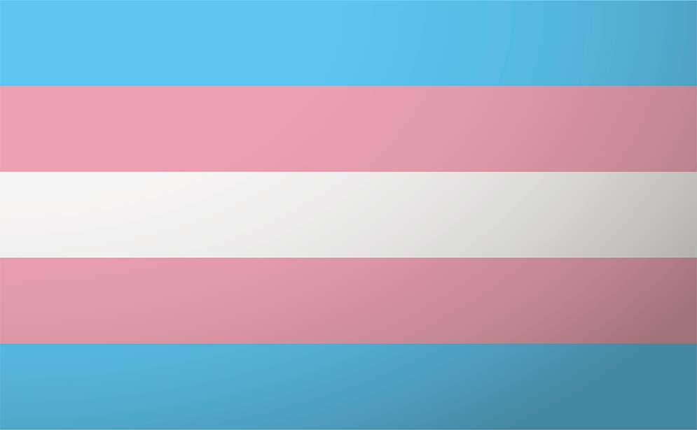
Transgender Pride Flags
The original Transgender flag, to me, is absolutely gorgeous and it always warms my heart to see it flown in public. No other pride flag, including the others which directly correspond to me, has that same visceral impact. It’s a thing of pale, delicate beauty in a cruel world that would gladly see us undone, and I feel that sense of fragile defiance whenever I look at it. It’s definitely a close second for me in the simple elegance of its conception as well as its ability to instantly communicate meaning to onlookers without words. While there have been alternatives thrown around in recent times, I personally find each of them to be very tacky and I’m glad they’ve never really caught on. The so-called “Trans Kaleidoscope” flag in particular is just about the most hideous thing I’ve ever seen. I will not mince words: it is an egregious insult to our community and if that was our flag, I’d be disgusted and ashamed rather than proud.
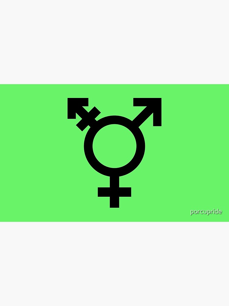
Needless to say, I wouldn’t want to replace the original–it’s just too special. Just for fun though, these are some different takes on the conceptual elements from that flag. Some of these utilize the astrological/alchemic glyph of Pallas Athena which, as I’ve stated previously, is my preference over the traditional transgender logo for many reasons. Admittedly, it probably only suits transgender women as opposed to men, but I don’t think it’s my place to give that subcommunity a different logo for themselves. Transmen can make their own unique emblem apart from the standard marker if they choose to do so, and it’d be more authentic to their group identity that way.


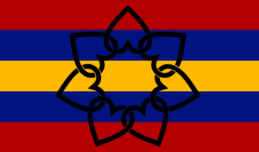
Polyamorous Pride Flag
The polyamorous flag is infamously hated among actual members of the community, so much so that the original designer felt the need to explain his rationale in a blog post two decades later. It’s actually kind of funny how detested it is anytime it comes up in both poly and vexillology discussions. Personally, I think the color scheme of Red, Black, Blue and Gold is fine, but what’s always bothered me was the arbitrarily selected Pi symbol. It’s just not immediately apparent that this Greek letter represents infinity, much less having multiple partners. (Why not just use the infinity symbol, for example?) I know the original creator has said that it was designed to be recognizable to the community itself, yet esoteric enough to appear innocuous to outsiders. But I think he made it a little too arcane, to the point where everyone I know who’s seen the flag, poly or not, could not understand what it was supposed to mean and immediately reacted with disapproval upon receiving an explanation. (I know that lambda is another Greek letter associated with pride…but I never thought that was a particularly good symbol either, and it’s fallen out of use for a reason.)
Anyway, numerous mockups in the years since have made use of the infinity-heart as a symbol of polyamorous pride but I’ve seen those get a mixed reception from community members as well. I’ve heard criticisms of it being generic and apparently it’s used by some religious groups so the branding could be confusing. I’ve also seen the use of a parrot (“poly,” get it?) but that doesn’t seem to be widely adopted either. I wanted to try something different, so that’s what these alternates represent.


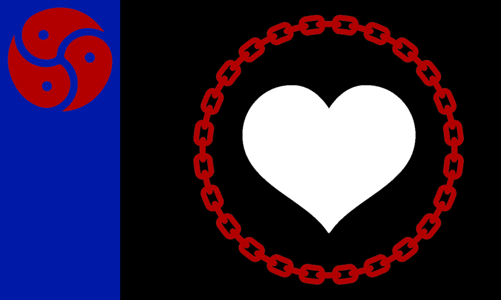
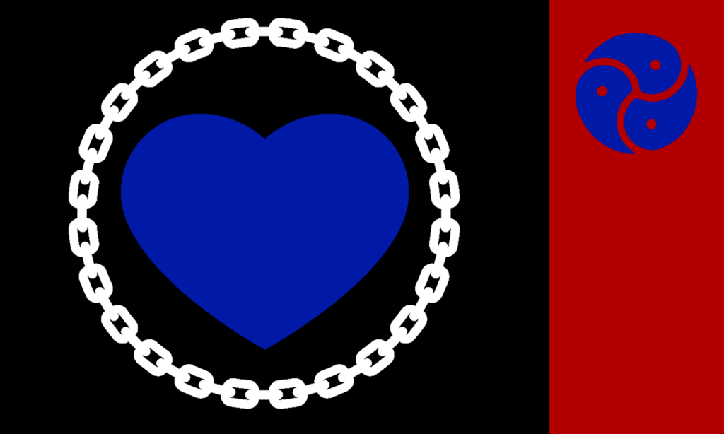
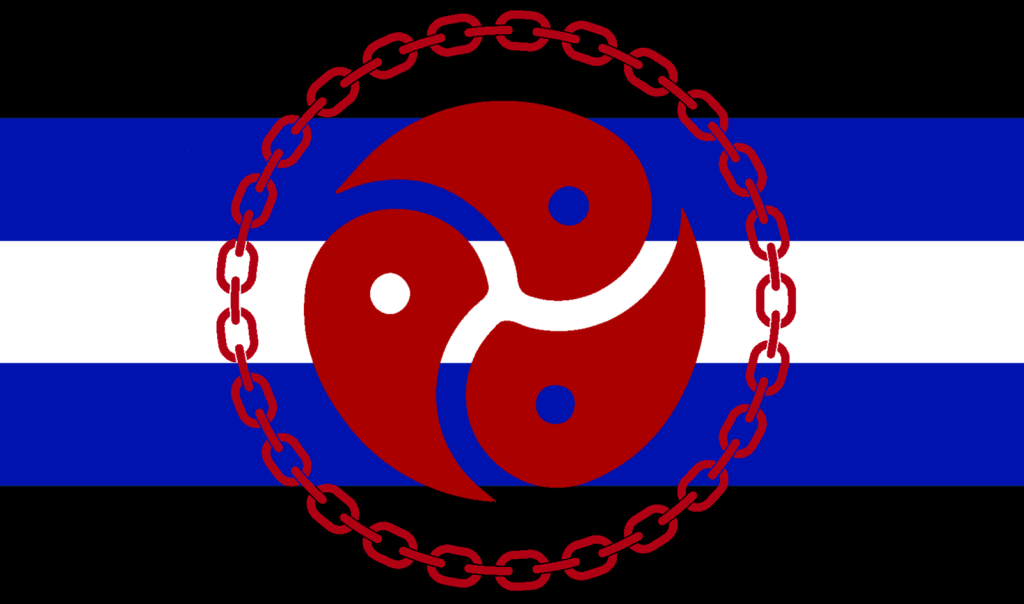
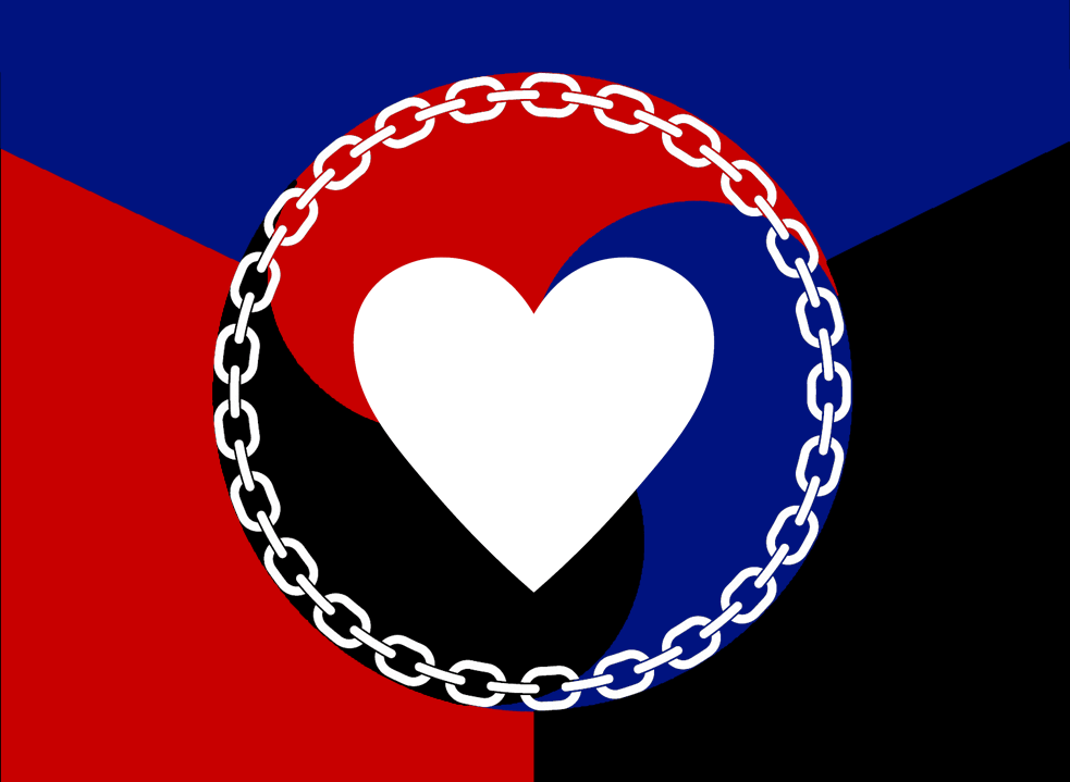
BDSM Pride Flags
There’s already a (relatively obscure) BDSM flag, as well as a Leather Pride Flag which is used by much of the community as well. I actually like those designs very much, I just think they use too many stripes for no good reason. (The designer has never offered an explanation for the design elements of the Leather flag, which the BDSM one was based on.) I find the basic concepts to be great, just the execution a tad busy for my liking. So, these are just some riffs based on those design elements. The triskelion has apparently been a symbol of the community since at least the ’90s, although I never knew that until just a few days ago. I’ll admit I’ve always wanted to make a flag or emblem using a chain wreath and this was the perfect opportunity to do so!


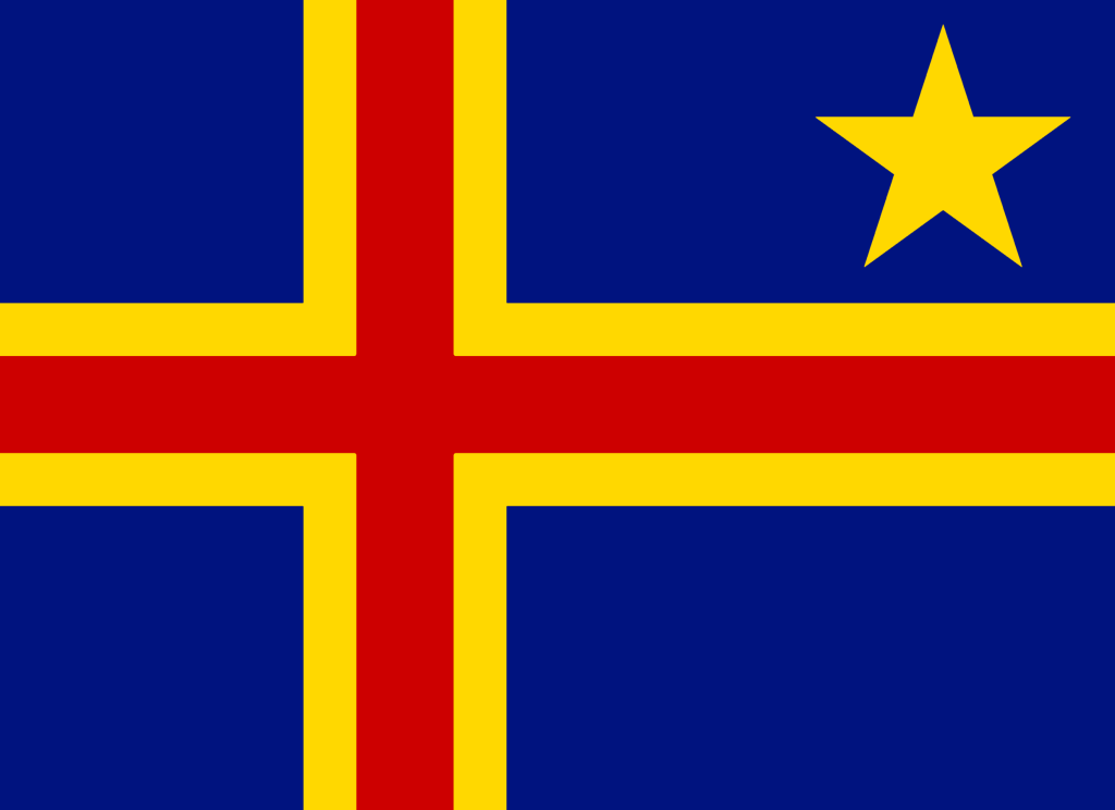
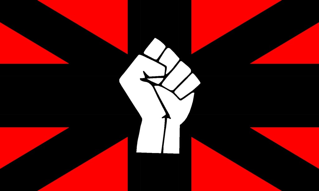
Just Me Goofing Around
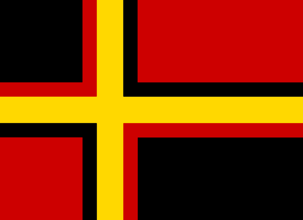
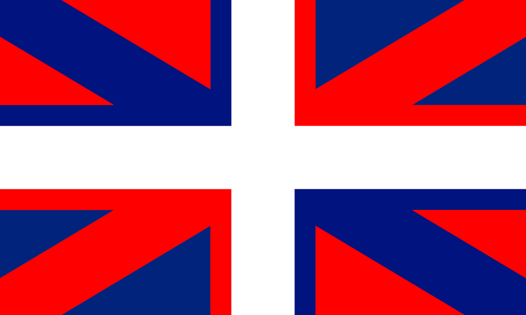
As the title says. These are just some flags I made for fun. They don’t have any particular intended meaning. They’re based on the Nordic cross and Union Jack. Nothing to do with pride, but I wanted to share them and saw no other opportunity in the near future to do so.


Some very creative designs. Since I have no real connection to any of the causes they represent I can’t comment on the appropriateness of the symbolism but I am sure they are well thought out. As usual your work makes me proud to be your friend!
LikeLike
It was your beautiful flag designs that encouraged me to comment at your blog in the first place. I checked out all the links in this post to existing flags and believe me your designs for alternatives beat them hands down. 🙂
LikeLike
i love the one with the star, and i changed it to a black star with the ancient egyptian hieroglyph for “beautiful/zero” in the middle. can i use it?
LikeLiked by 1 person
Of course, by all means
LikeLike