
I haven’t been able to finish any writing prompts lately, due to various personal and scheduling issues. That said, I still have a handful of entries in various stages of development, so look forward to those in the near future. I’m hoping to have a few more essays up within the next 2 weeks.
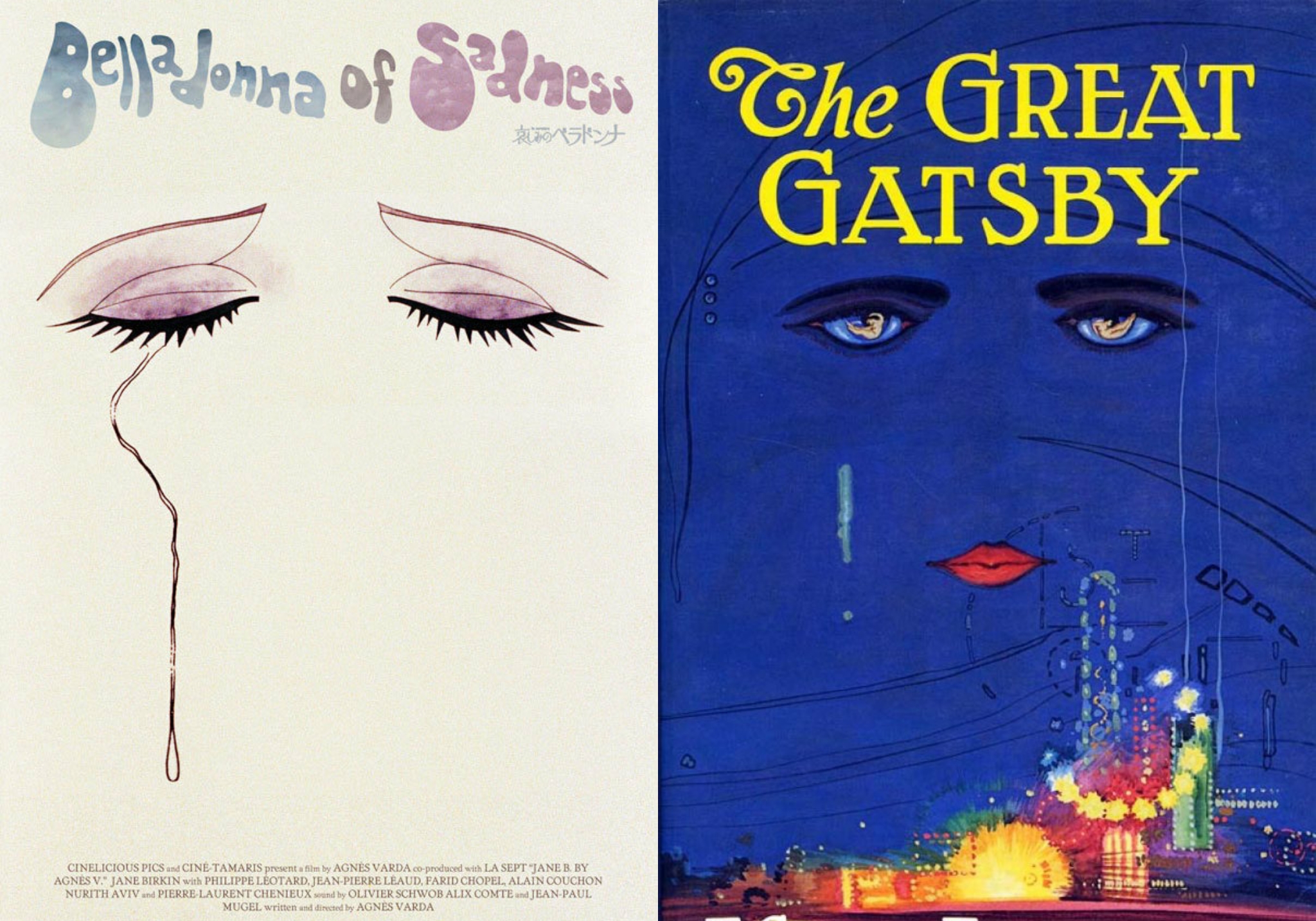
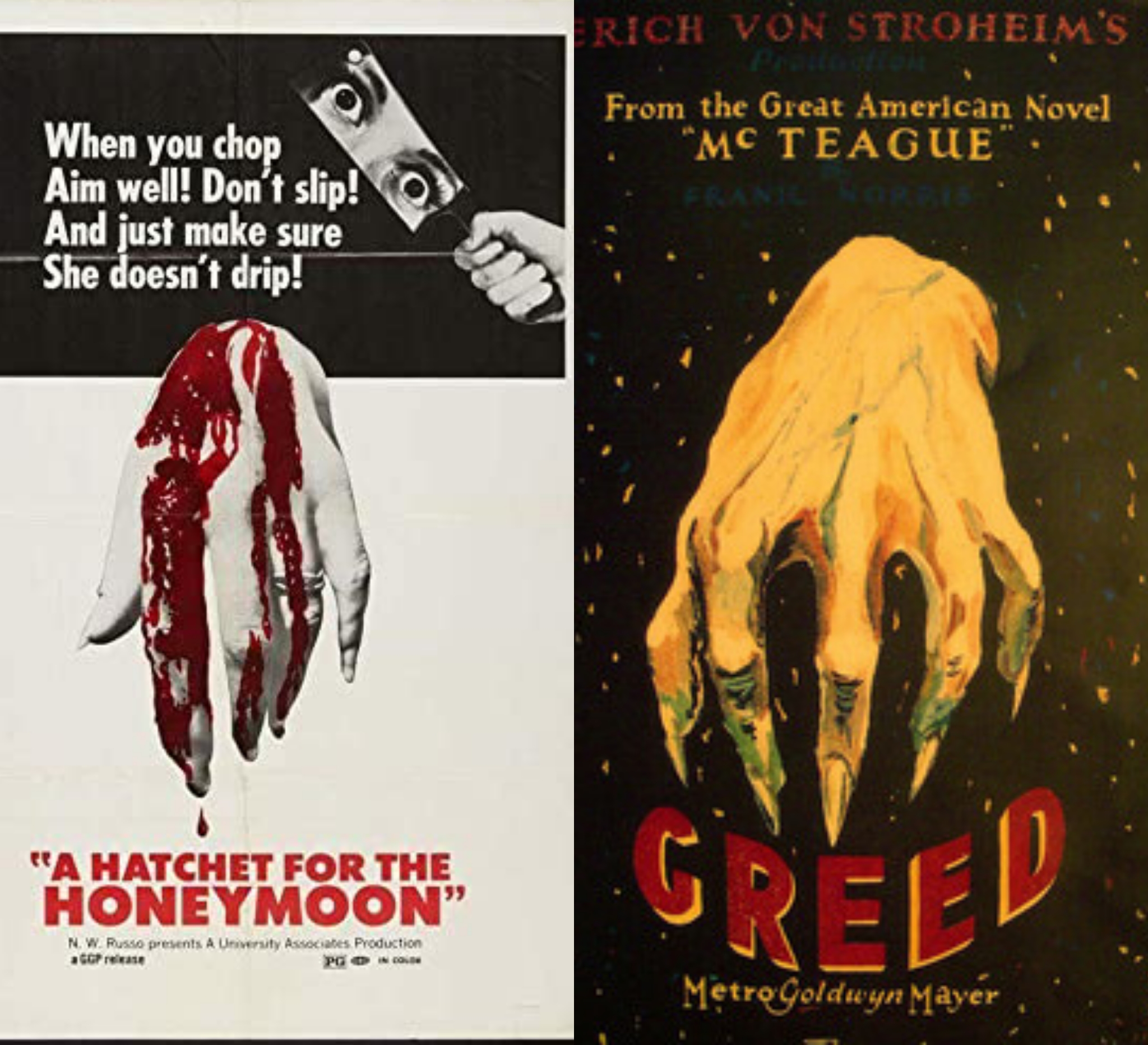
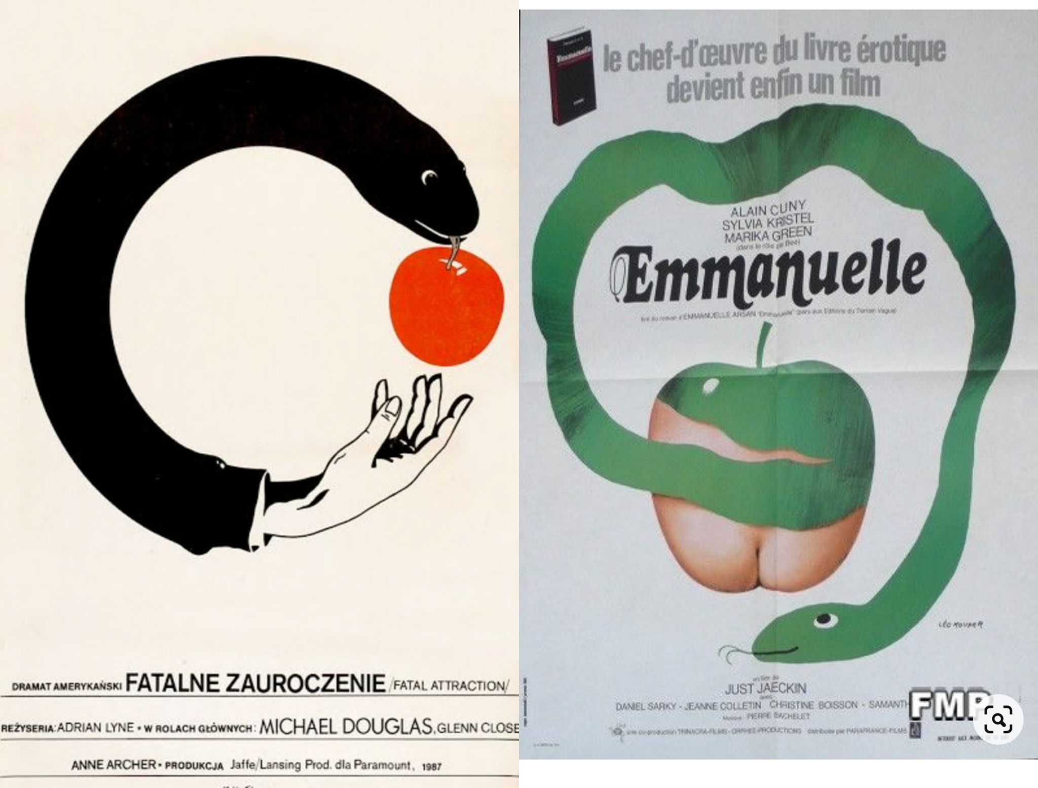
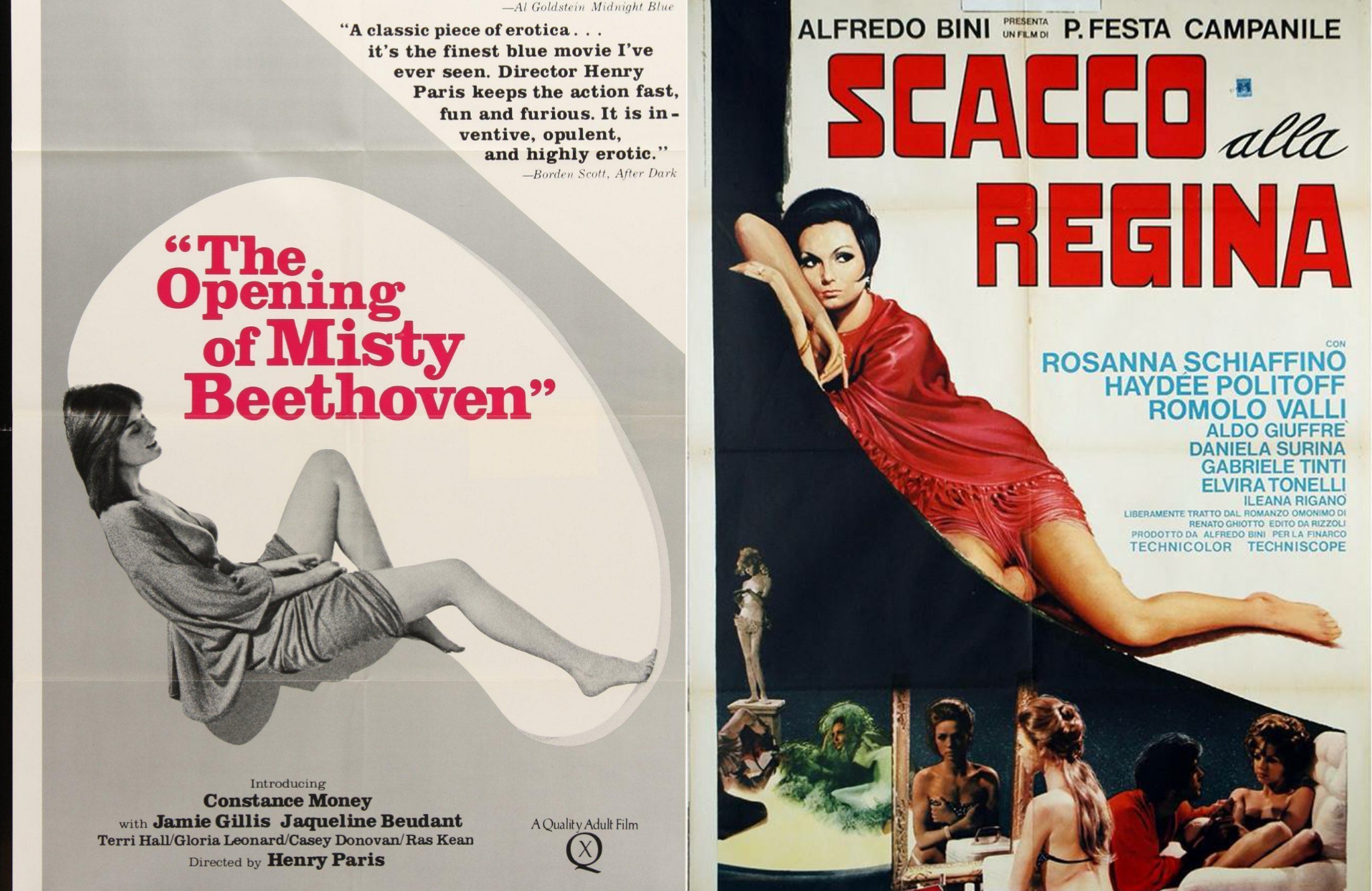
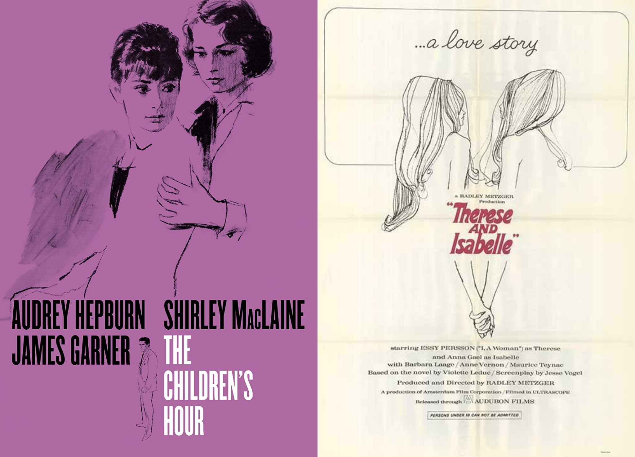
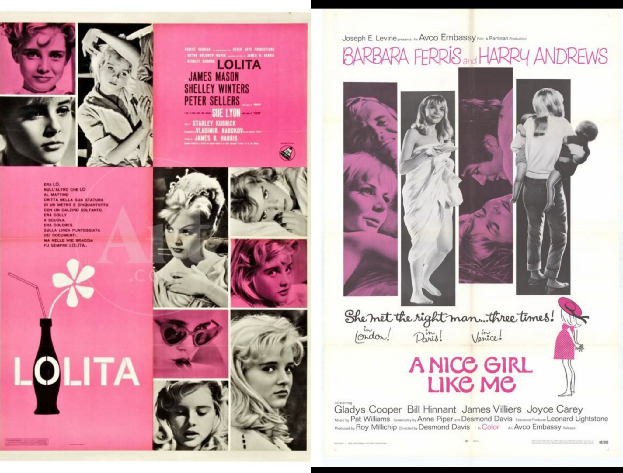
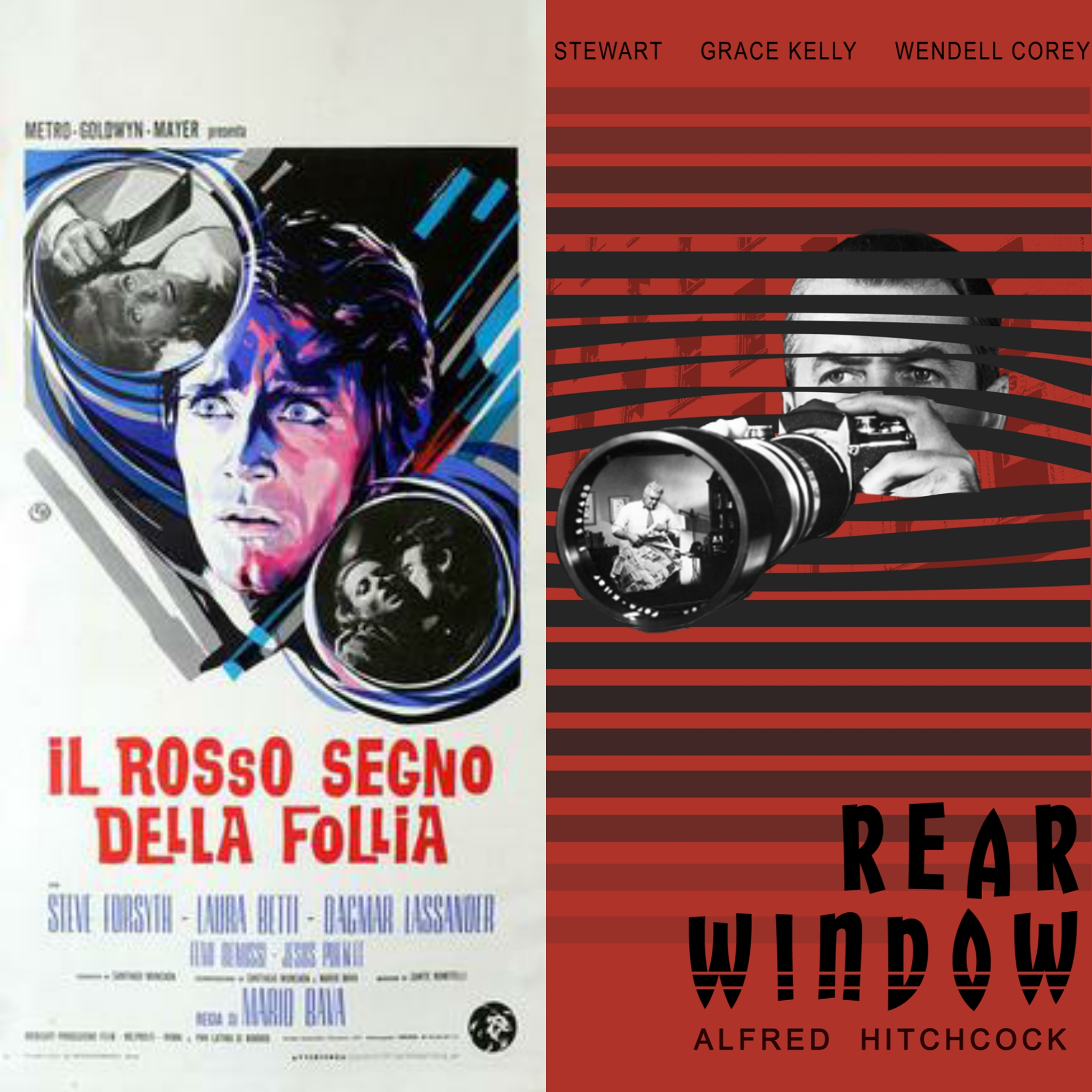
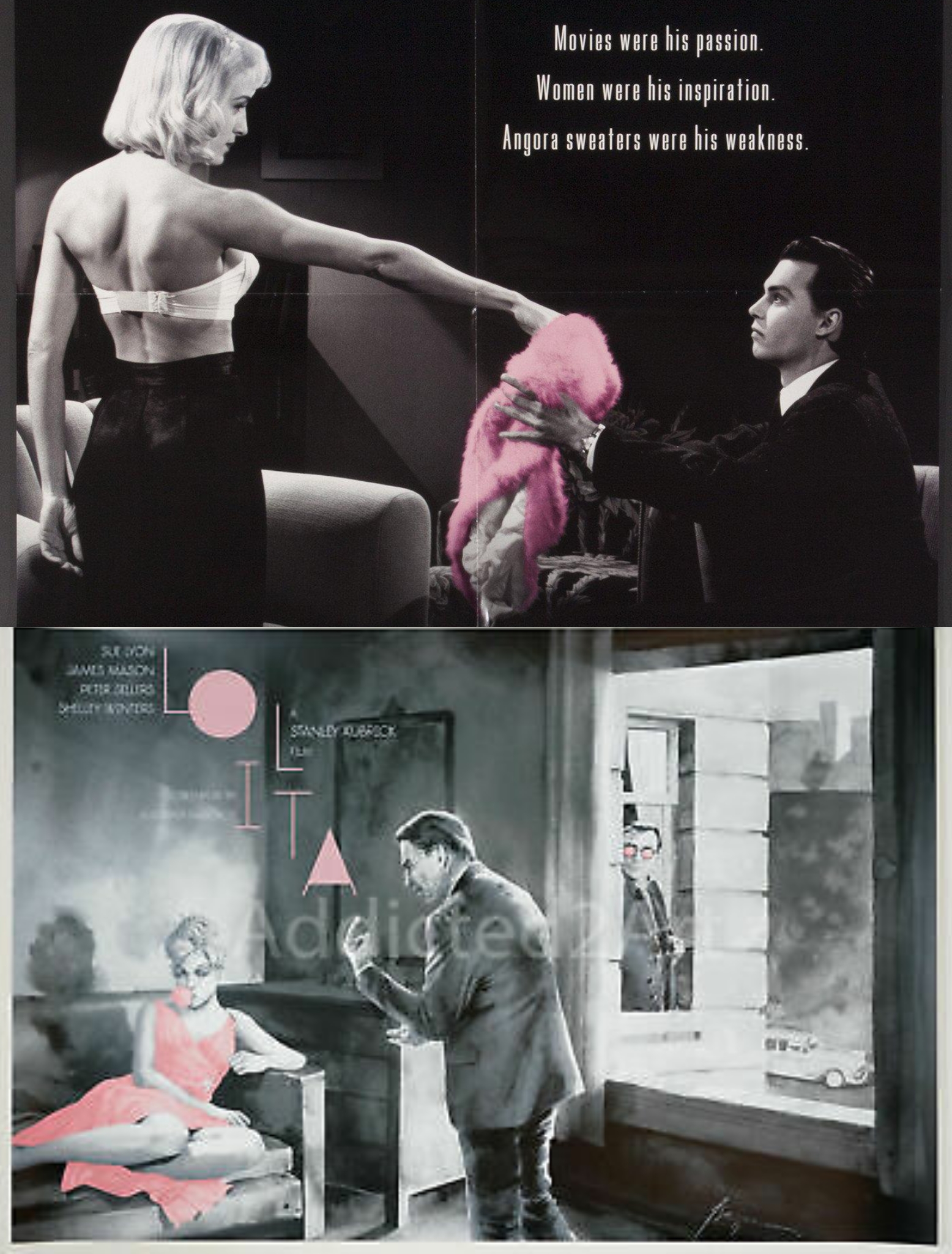
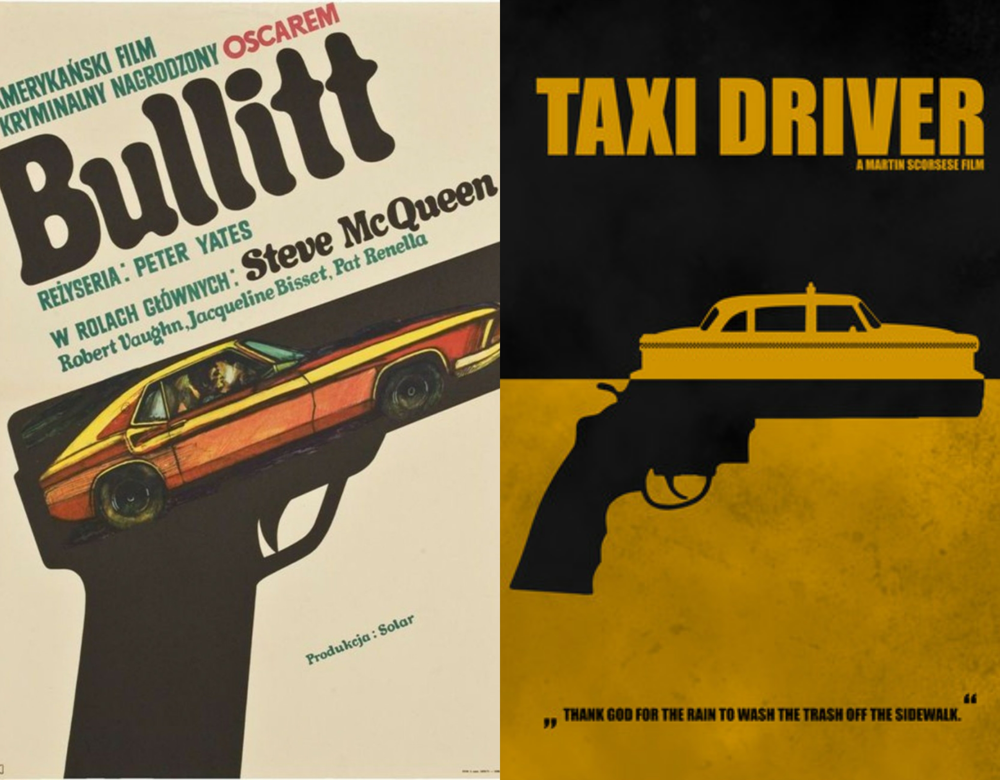
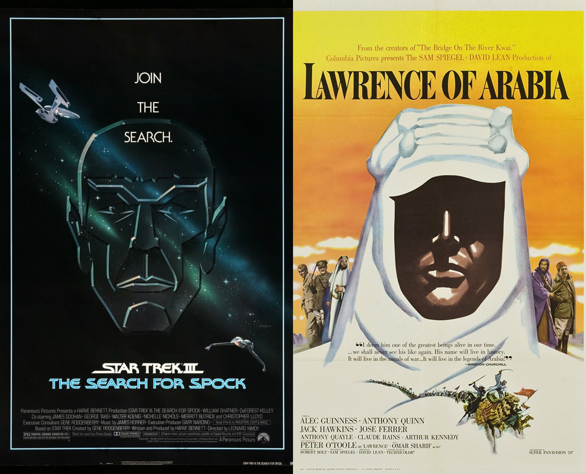
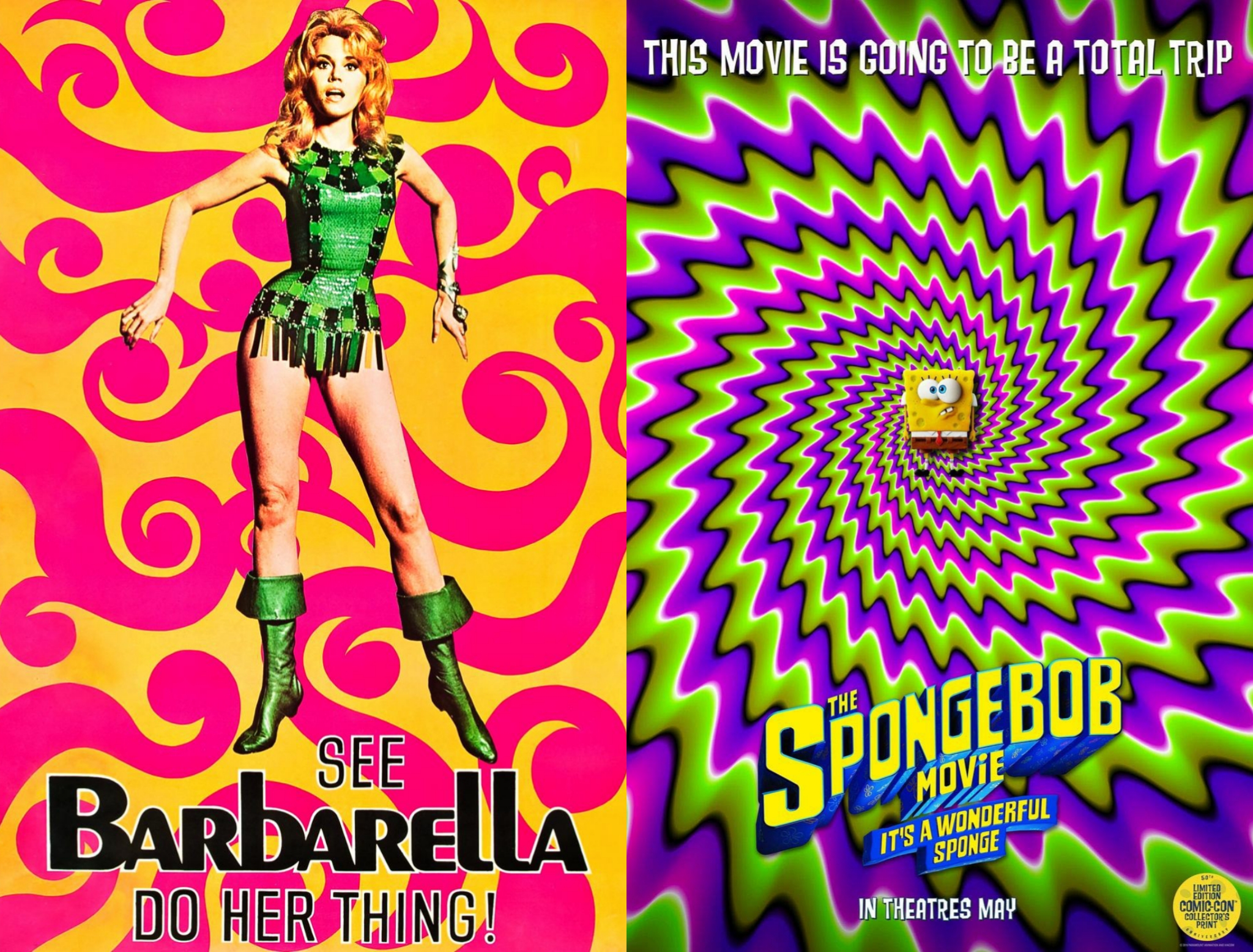
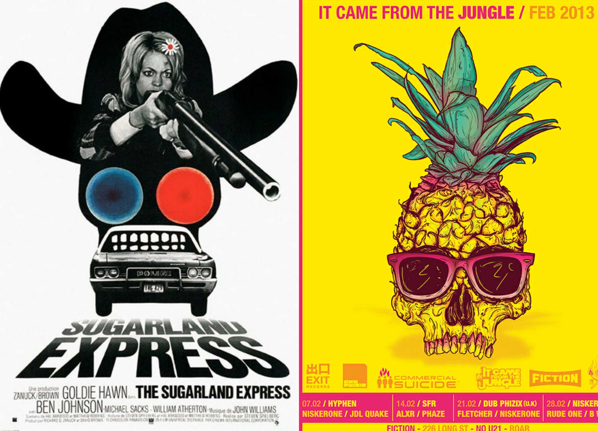
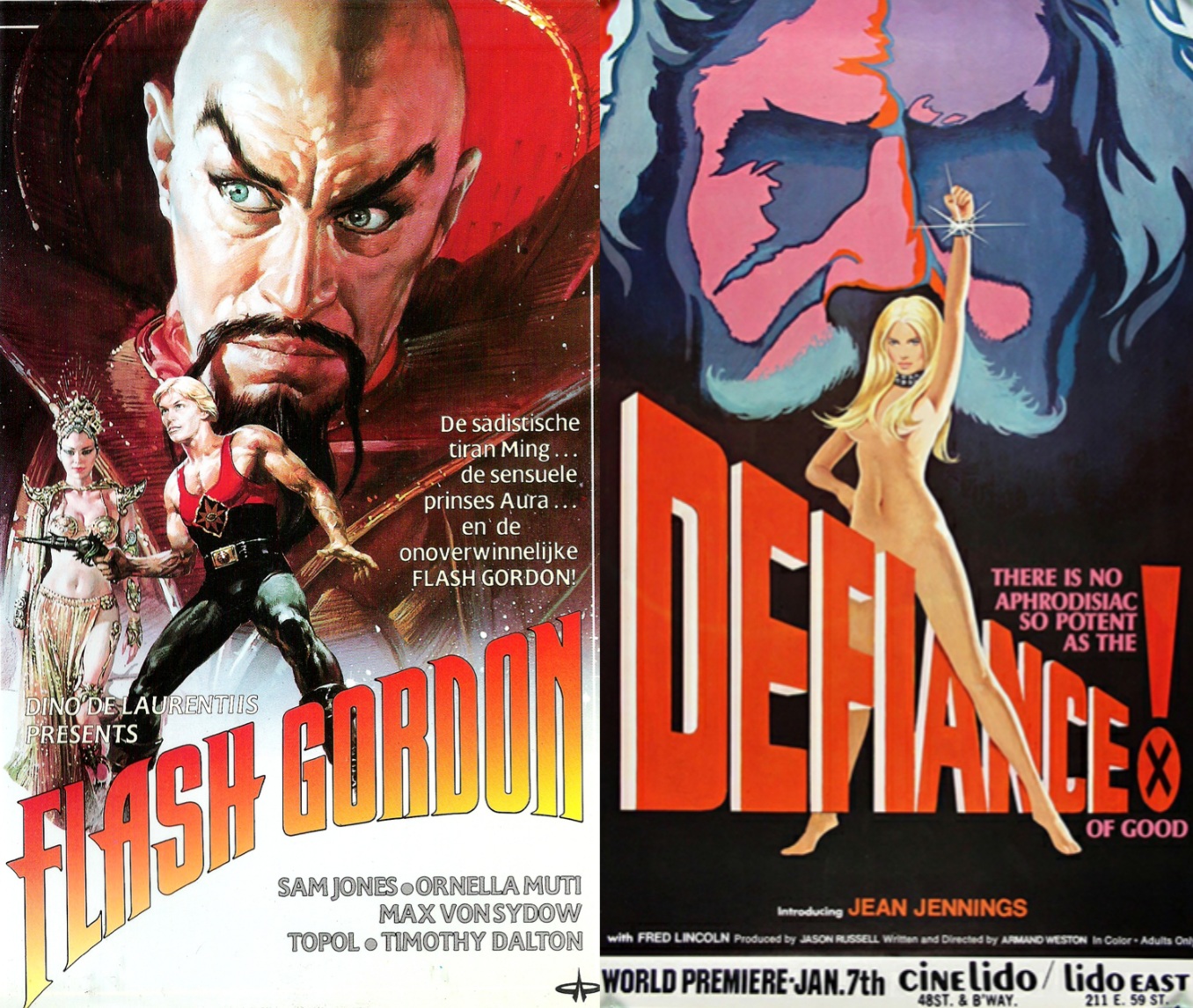
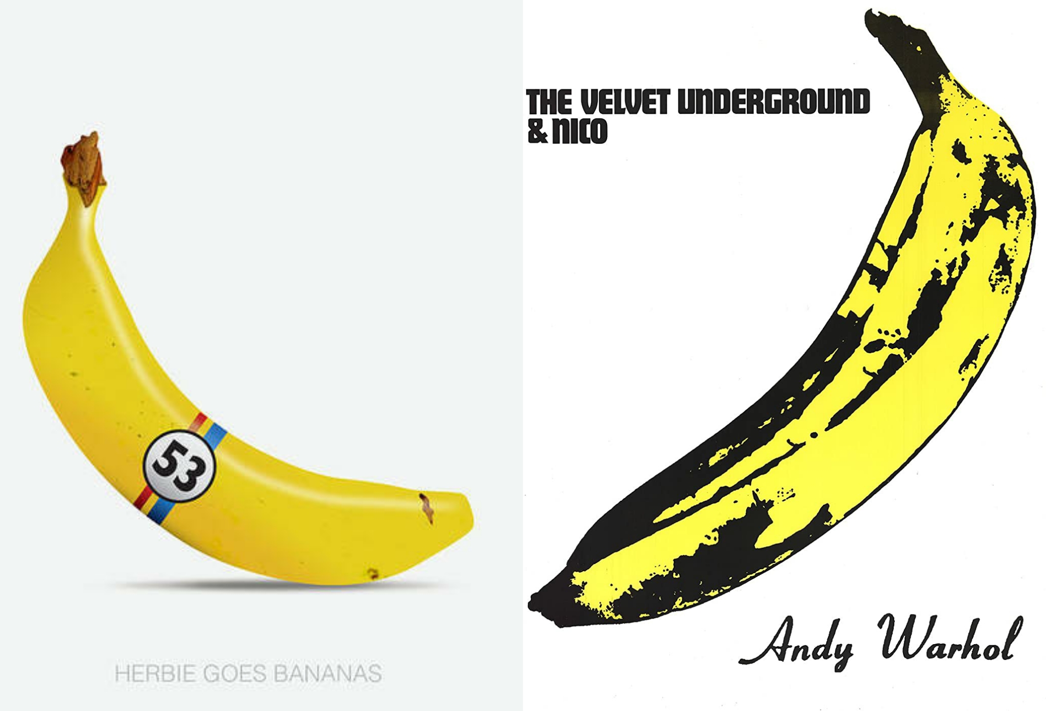
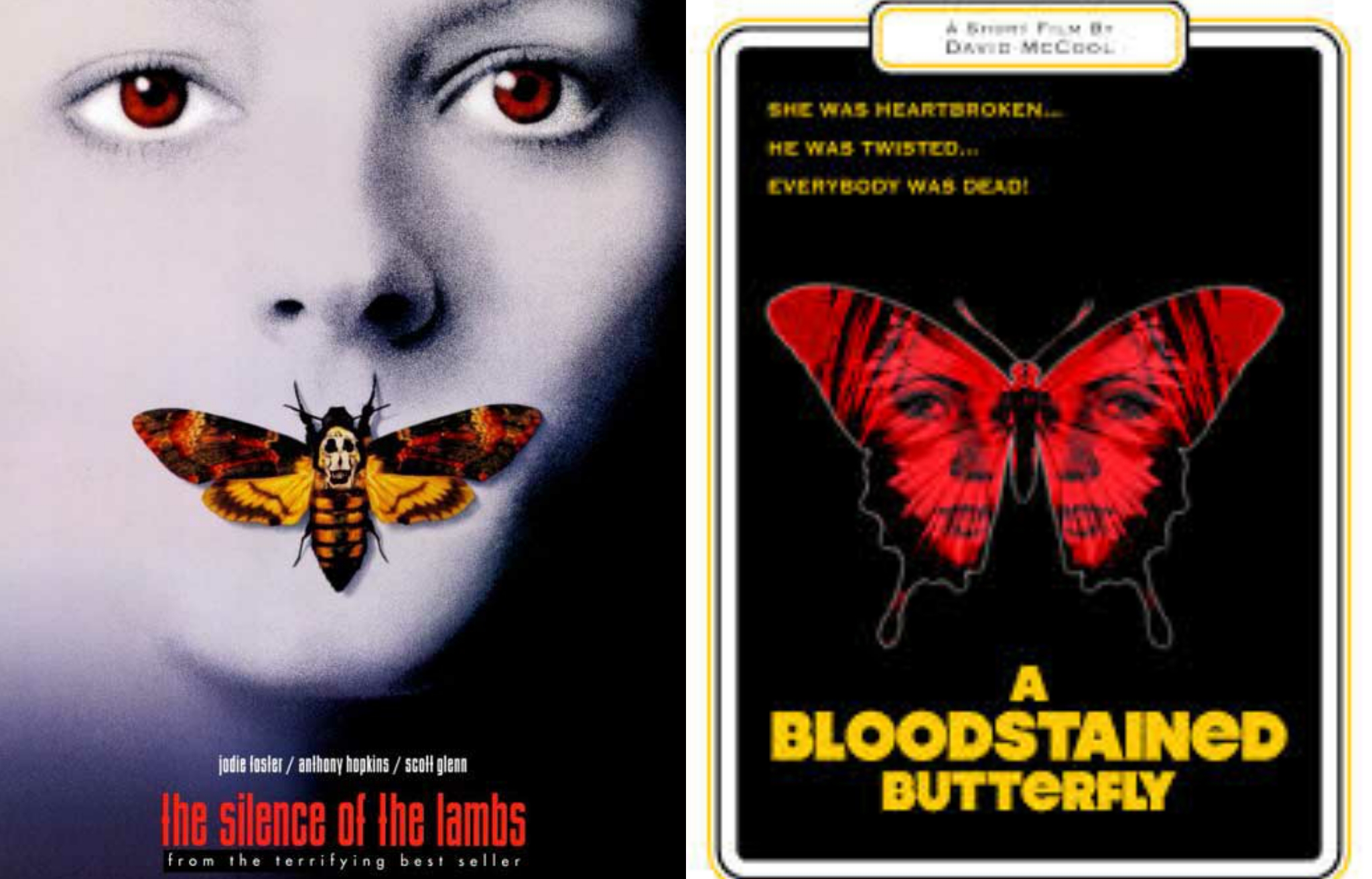
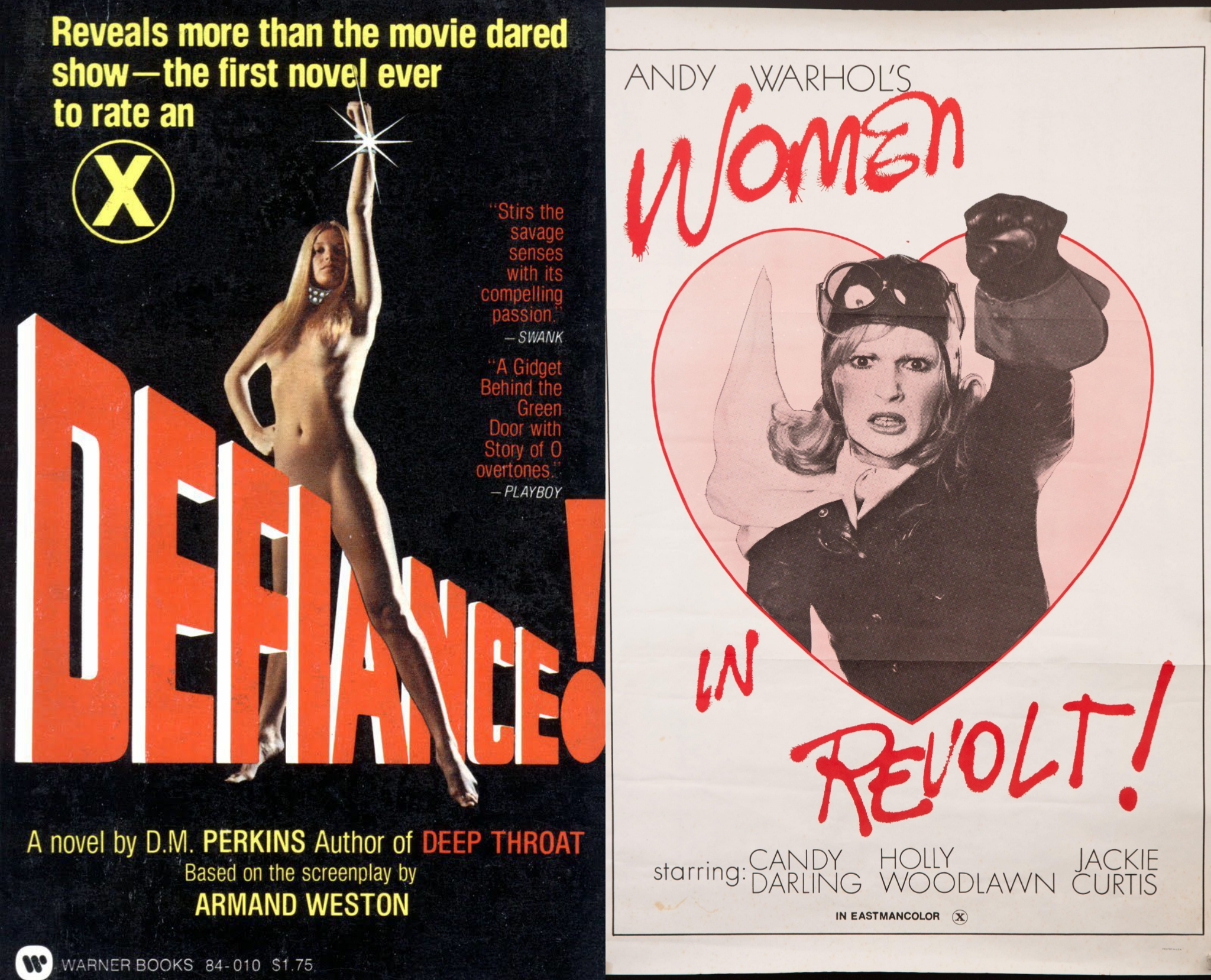
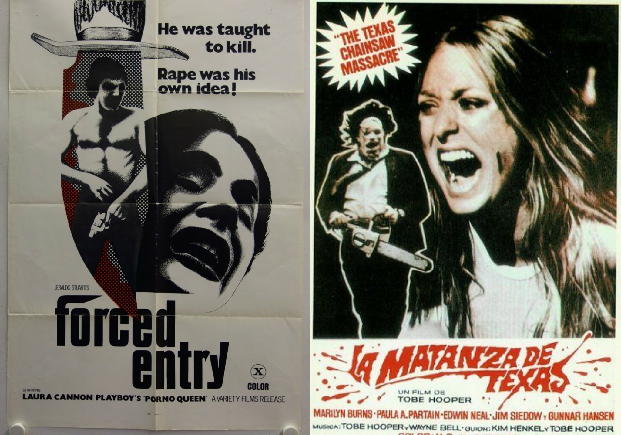
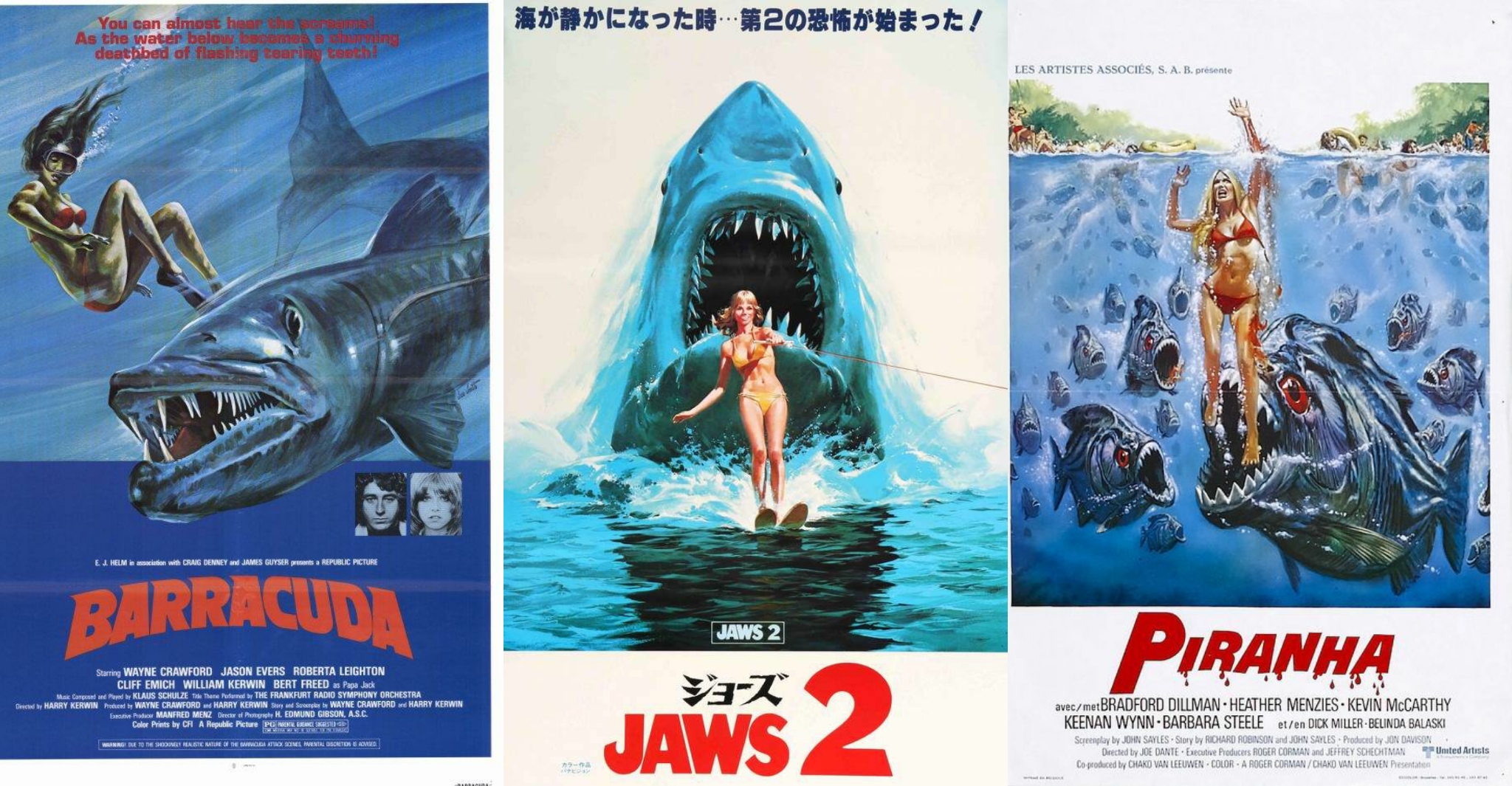
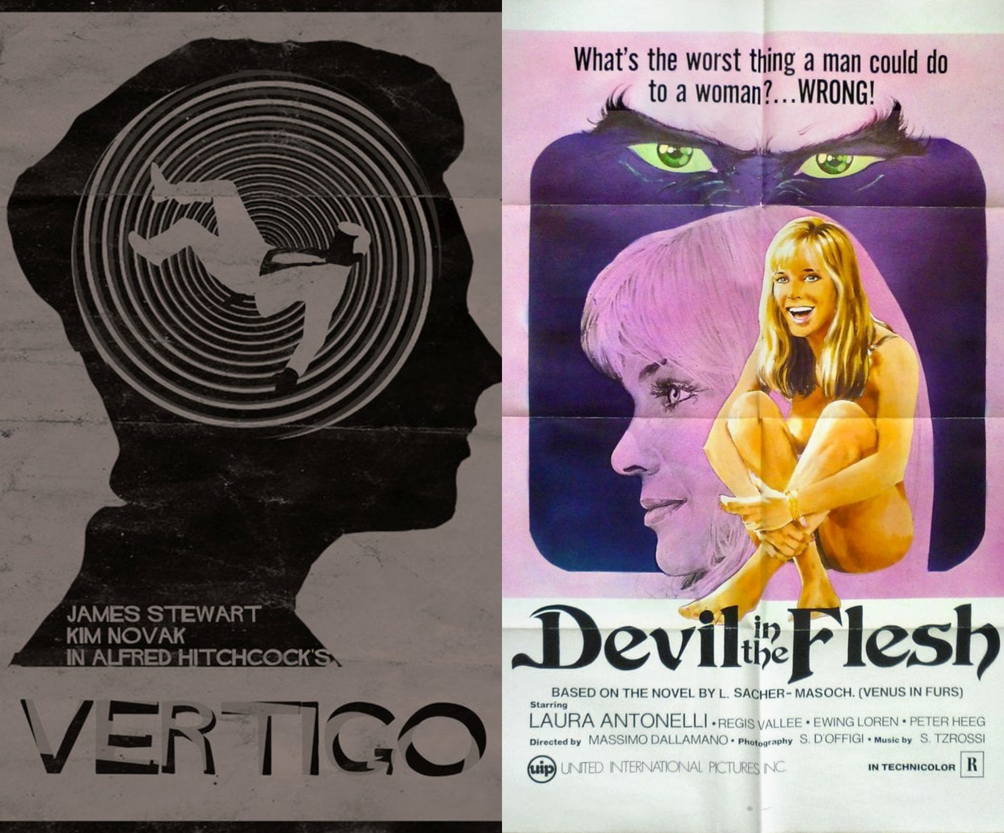
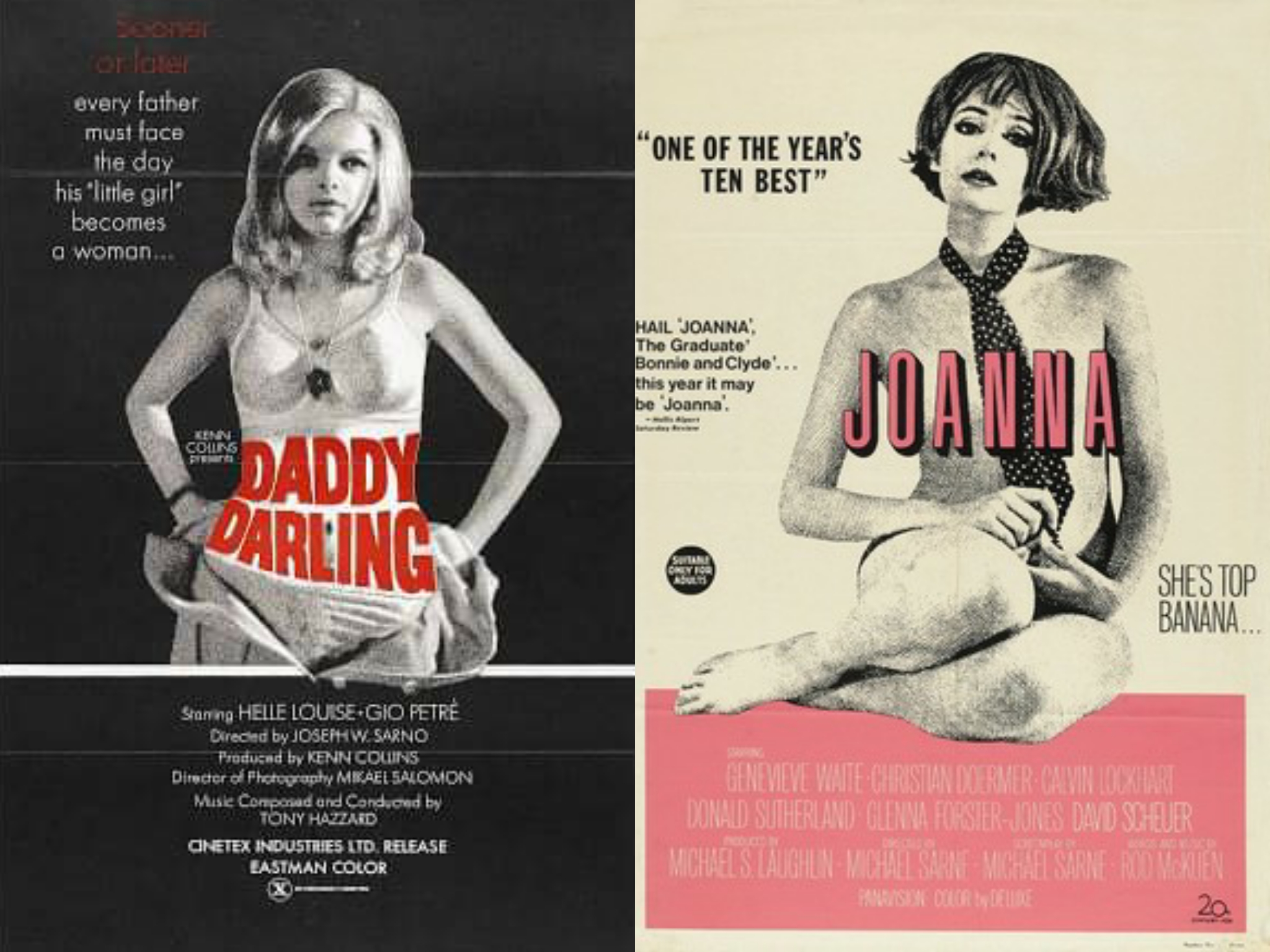
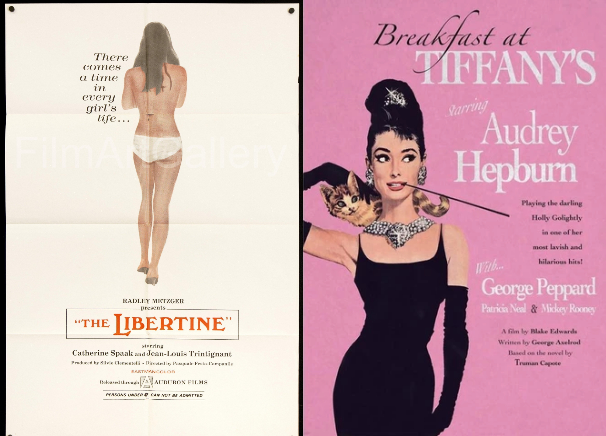
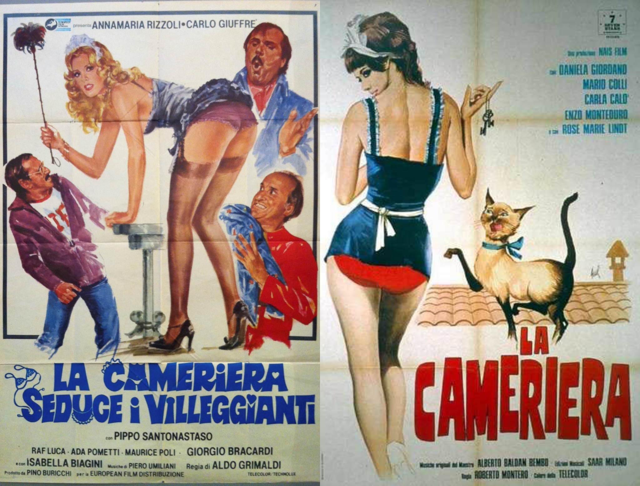
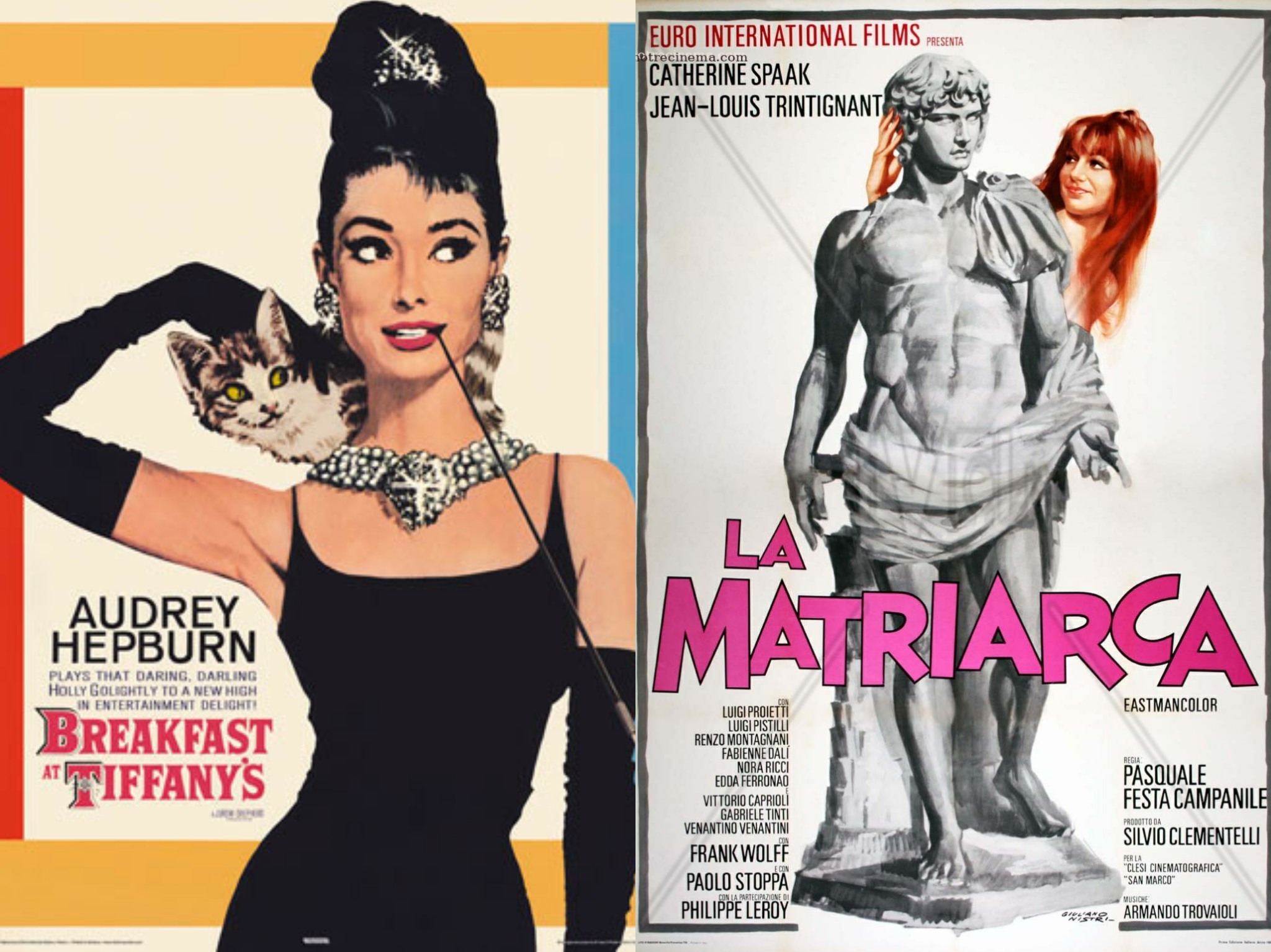
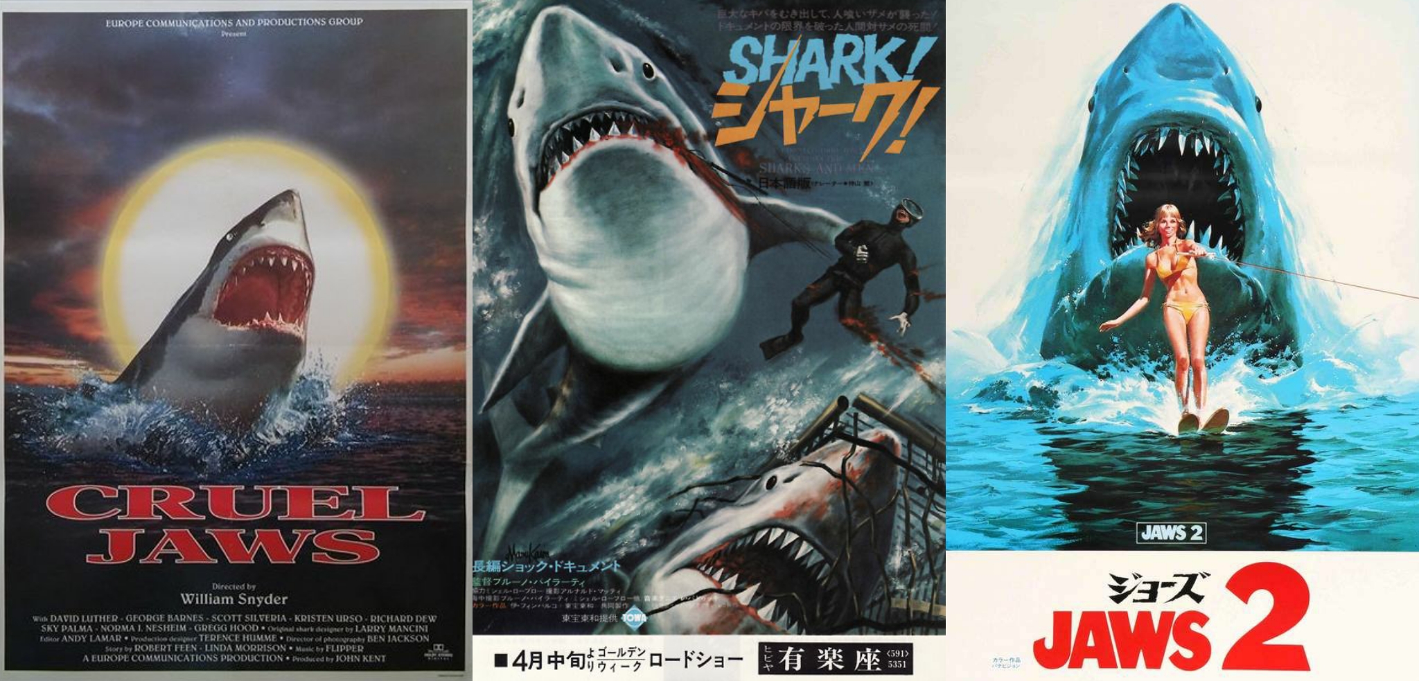
In the meantime, here’s another light post to hopefully stave off boredom in this COVID/social distanced nightmare. I’ve been examining various film posters (plus book and album covers) and noticed some cool parallels among them. Below are some notable sets of “twins” which share a design aesthetic, pose, color scheme, subject matter or some combination thereof. I might update this post or even do a sequel someday as more examples come to mind. Feel free to share any other poster look-alikes in the comments if you can think of any!


good observations of design. There are some designs that work and are used over and over. Wally Wood did a design sheet for comic book artists of comic book panels that are interesting and work. You can find many of these poster designs on his design sheet. Letters of the alphabet are also sometimes used to create interesting design. You have a good sense of design to see the patterns.
LikeLike